Project managers juggle a variety of processes, programs, and people. With so many variables interacting and affecting the trajectory of a project, it can be difficult to understand how each element works together and influences outcomes.
Matrix diagrams help project managers visualize and evaluate those complex relationships so they can make better decisions and keep projects on track.
What is a matrix chart?
A matrix chart or diagram is a project management and planning tool used to analyze and understand the relationships between data sets.
Matrix charts compare two or more groups of elements or elements within a single group. They help project managers identify how information is related as well as the strength of those relationships.
The types of information you can analyze in a matrix includes:
- Data
- Functions
- Concepts
- People
- Materials
- Equipment
- Actions
The relationships between items are indicated by a number or symbol in the cell where each pair of elements intersect.
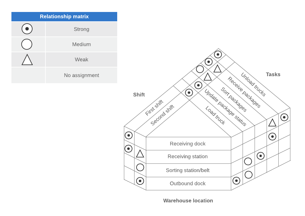
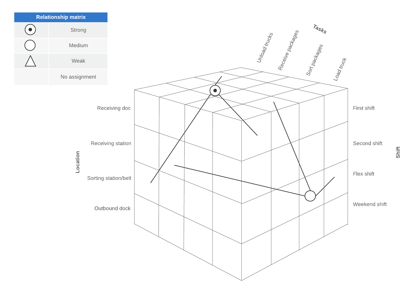
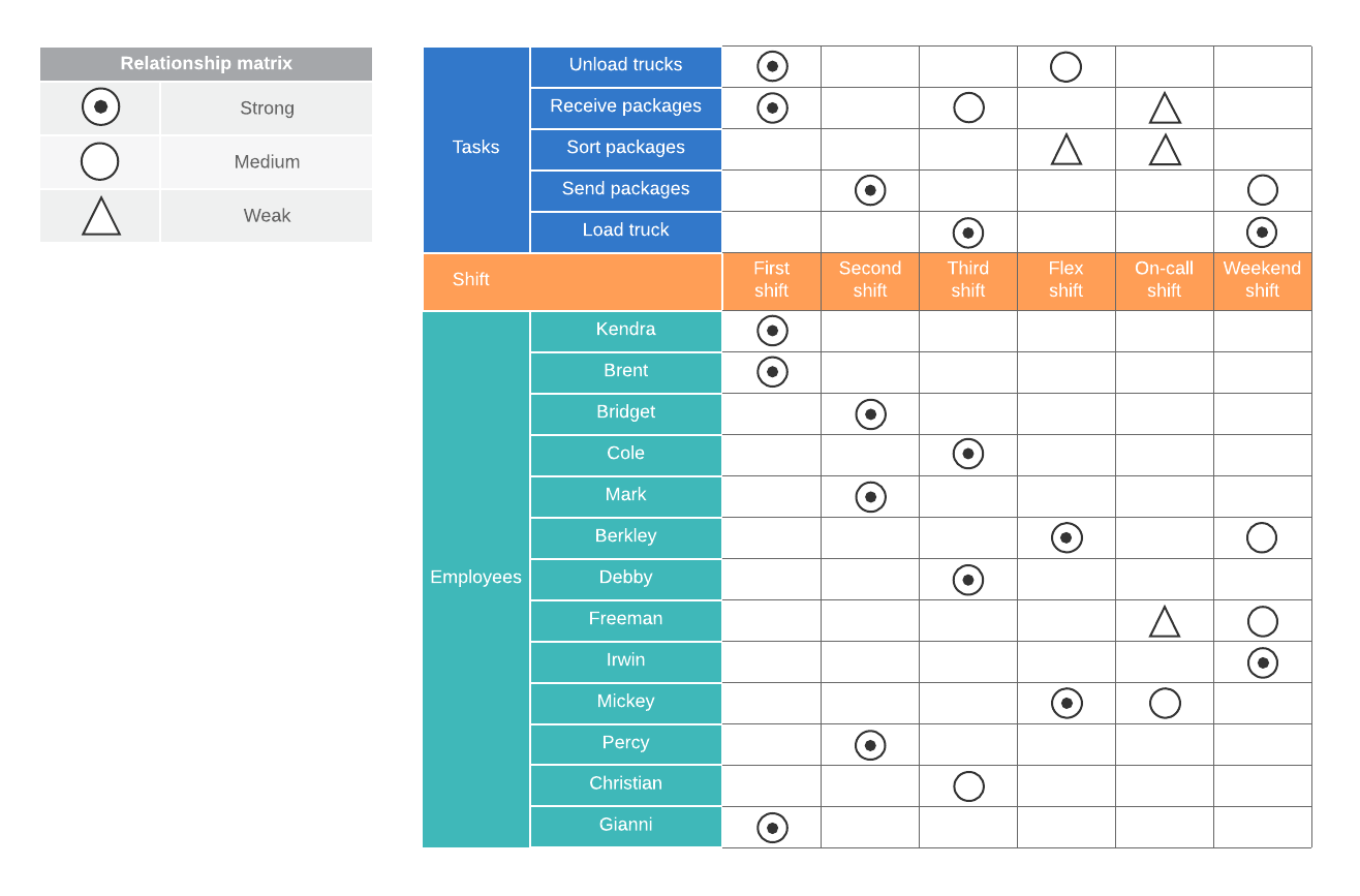
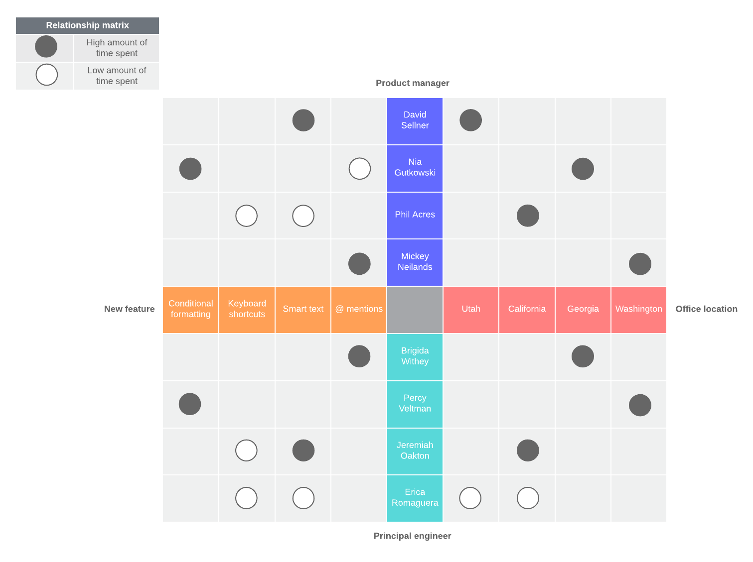
The matrix shape you use will depend on the number of elements you want to compare. There are five common matrix diagrams: L-shaped, Y-shaped, C-shaped, T-shaped, and X-shaped.
Why use matrix diagrams?
Matrix diagrams are an effective tool for visualizing complex (many-to-many) relationships. They help project managers identify the different ways elements interact and depend on one another in order to make better decisions, solve problems, and improve processes.
By putting groups of elements into a matrix chart of rows and columns, project managers can more easily visualize the relationship between objectives, factors, and causes within the organization they are observing.
For example, when comparing two lists with a simple one-to-one relationship, you can easily depict the relationships in a straightforward side-by-side table. However, if some of the elements in the list are related to more than one other element, the side-by-side table visualization is inadequate. The connections between each element become tangled and difficult to track.
That’s where a matrix diagram comes in.
A matrix diagram charts those complex relationships clearly by documenting the two (or more) lists as rows and columns and mapping their relationships within the cells.
When to use matrix diagrams
You can use matrix diagrams whenever you need to identify and assess the relationships between two or more sets of data.
Common applications of matrix analysis include:
- Identifying the causes of problems
- Matching requirements with specifications
- Allocating resources based on need or competency
- Comparing possible solutions
- Identifying opportunities for improvement
- Reviewing how well requirements are met
Matrix diagrams are especially helpful when trying to understand causal relationships or conducting quality function deployment (QFD) analysis.
Types of matrix charts
There are five basic types of matrix charts. Below we cover what each type is and when to use it.
L-shaped matrix diagram
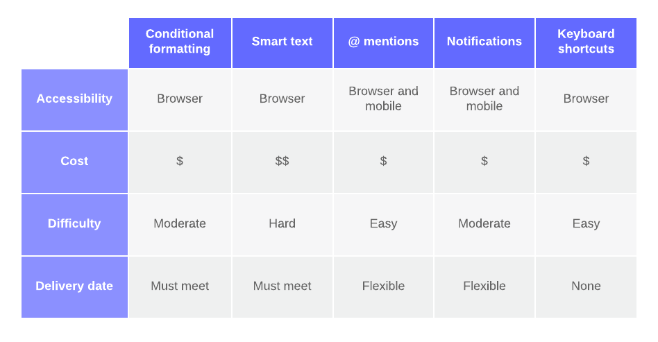
What is it: The L-shaped chart is the simplest and most common matrix diagram. It compares two sets of data in a two-dimensional table.
One data set is represented on the left-hand column and it is compared against the second data set in the top row of the table. Numbers or symbols notate the relationship between pairs in the intersecting cells.
You can also tally the scores and note the totals on the end rows to help rank or prioritize items within the chart.
When to use it: Use the L-shaped diagram when you need to compare two groups of items or one group to itself. The example below shows different features and their corresponding costs and requirements.